Overview
If you're in charge of planning a bachelor or bachelorette party, this app is your go-to tool. It simplifies everything. Pick the perfect destination, activities, and manage invitations all in one place.
Plus, it helps you stay on budget, keeps everyone in the loop with chat, and even lets you create surveys to gather input. It's all about making party planning a breeze, so you can create a unique and unforgettable experience, whether it's a wild night out or a more sophisticated gathering. This app has got you covered.

Seeking the best party
“I would like to give the bride the best experience!”
“I believe in creating extraordinary moments and experiences. Money is not an obstacle when it comes to celebrating special occasions and making lifelong memories”
“it's always difficult to agree on all the decisions that need to be made, and it's also challenging to accommodate everyone's personal and financial circumstances.”
Goals
User Pain Points
User Needs and Expectations
Feature Prioritization by benchmark
Usability and User Experience
Testing Prototypes and Features
User persona

“I would like to give my friend the best experience!”

Competitive Audit
In the competitive audit, I focused on companies that offered plans for farewell parties or group outings with friends. It's worth noting that the apps I found are primarily located in North America, despite the tradition being celebrated globally.

The first table examines general characteristics of each company, while the second table focuses on the specific features offered by each app.
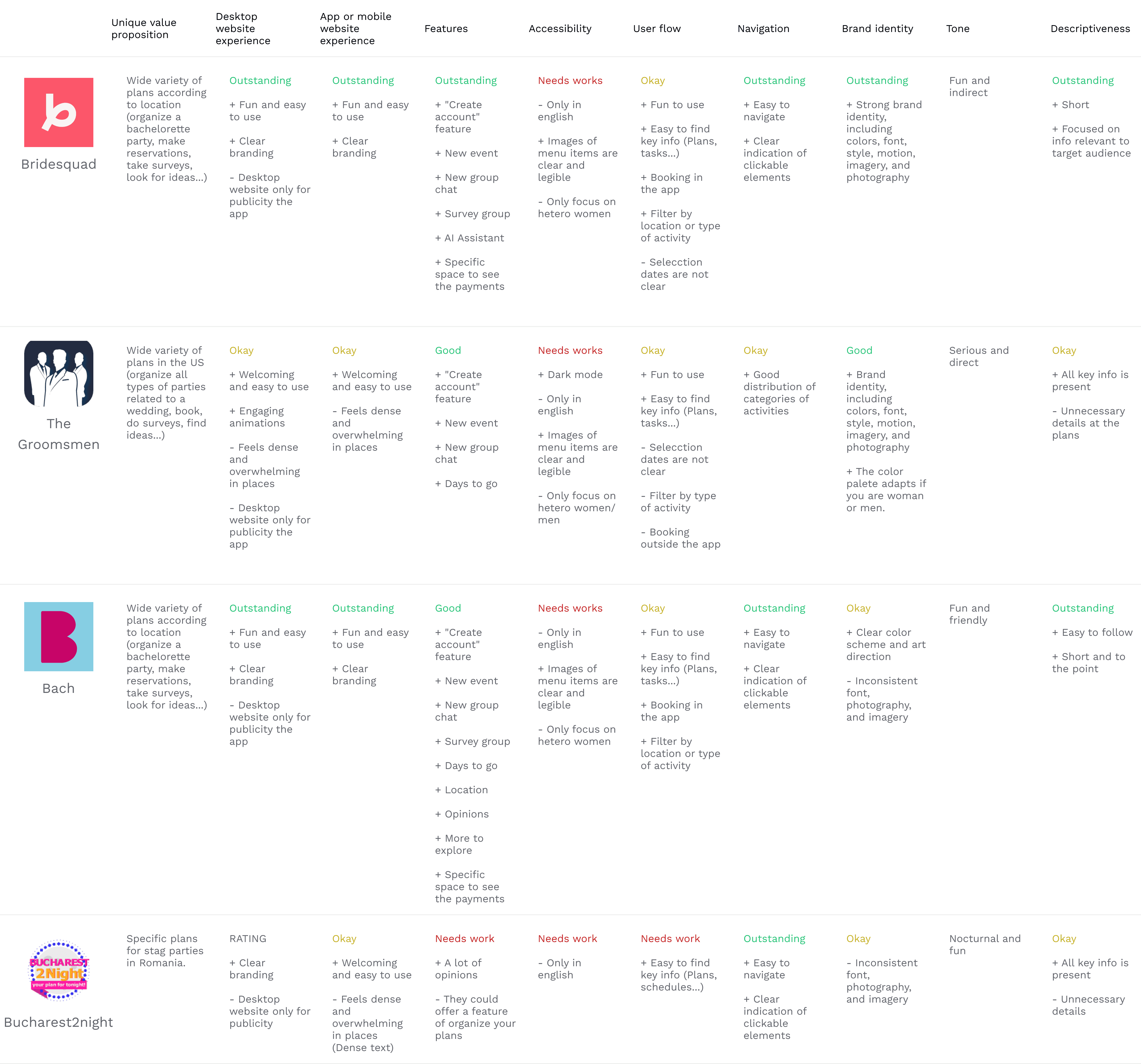
Competitive Audit Report
Bridesquad:
Attractive, fun, and feminine design with a predominant pink color.
Key features:
Group chat with friends.
Polls with statistics to help decide on plans.
AI assistant to guide the user.
User-friendly payment system.
Limitations:
Very specific target audience: women.
Only available in English.
Groomsmen:
Minimalist and serious design with a predominant black color.
Key features:
Easily accessible group chat.
Two app versions (men/women) with different themes.
Dark mode.
Countdown to the big day.
Limitations:
Only available in English.
Bookings are made outside the app.
Focuses on traditional heterosexual relationships.
Gaps and opportunities
Some gaps we identified include:
Both applications do not offer suggestions for activities that could be done during bachelor/bachelorette parties.
Both applications should be linked to the resources generated on the day of the activity.
Both applications are focused on heterosexual audiences.
Some opportunities we identified include:
Provide a list of challenges for the bride/groom to choose from to complete on the day of the party.
Provide photographic material of each activity by the organizers.
Include activities that cater to sexual diversity and include the LGBTQ+ community.
UX Design Storyboard

Starting the design
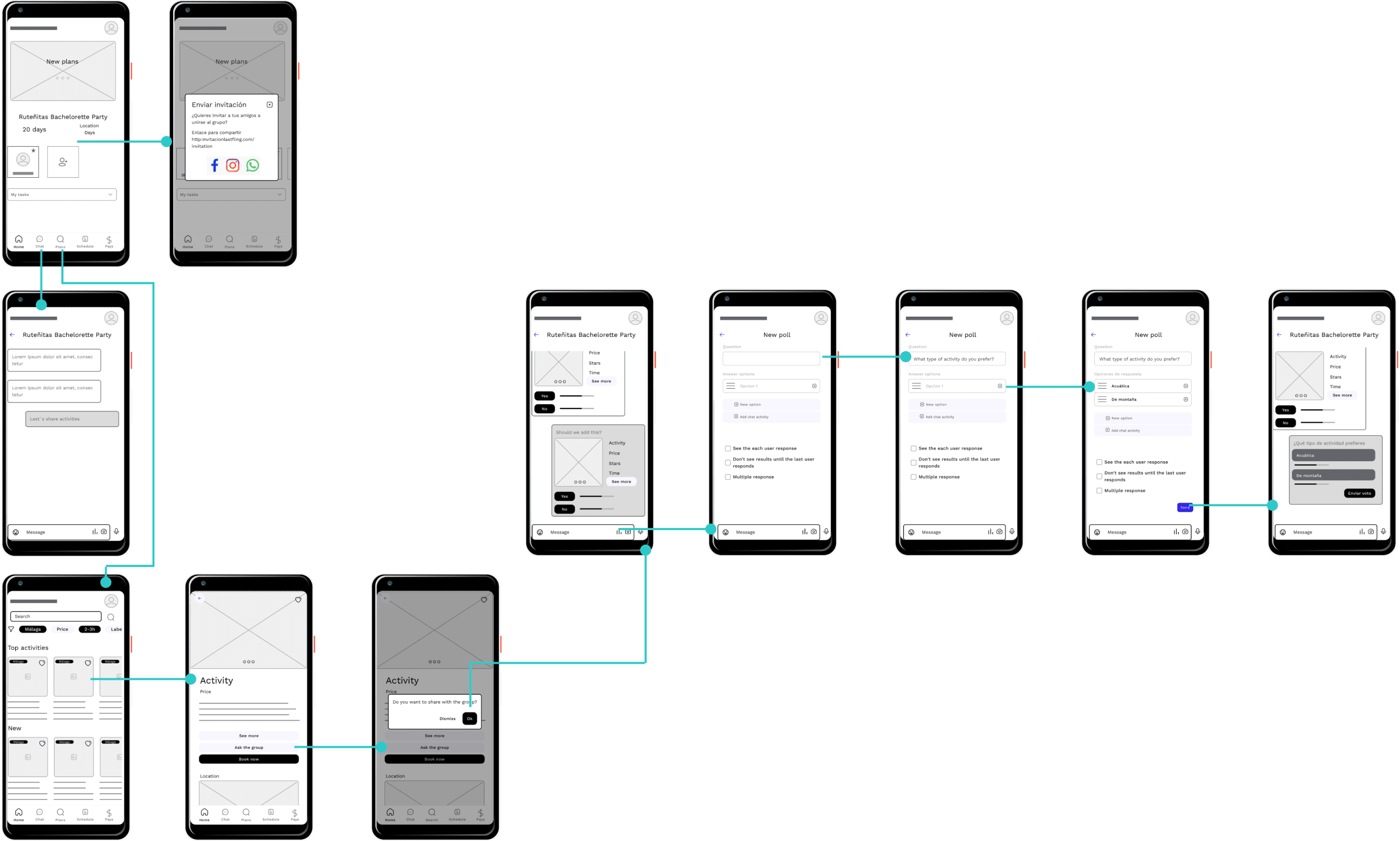
To conduct the first usability test, I prepared the initial significant flow that would serve as the MVP. In this flow, users would be able to:
Invite friends to the group
Search for an activity
Share it with the group of friends
Conduct a survey to decide on the activity to pursue.
Low Fidelity prototipe

Once the prototype was prepared, it was necessary to organize the details of the usability study, including the questions and the users who would be interviewed.
Study Details
How long does it take for 4-5 people to select and share an activity that they like in the app?
Are users able to successfully share the activity that they want?
What can we learn from the steps users took to share the activity?
Is the poll process easy for the customer?
5 participants
3 males and 2 females between the ages of 25-40
20 of minutes
Spain, remote
Moderated usability study
Users were asked to perform tasks in a low-fidelity prototype

I categorized these ideas by theme types, which would assist me in identifying focal points for improvement—areas where the majority of users had common feedback. Additionally, this process helped me discover improvement opportunities and gather insights that I found interesting to incorporate into the design.

Research insights
Refining the design
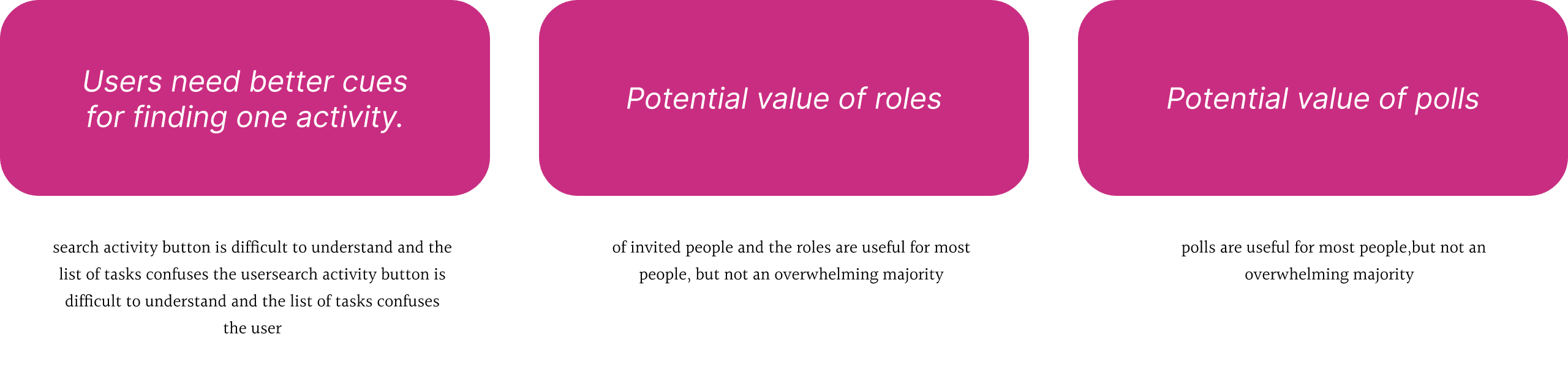
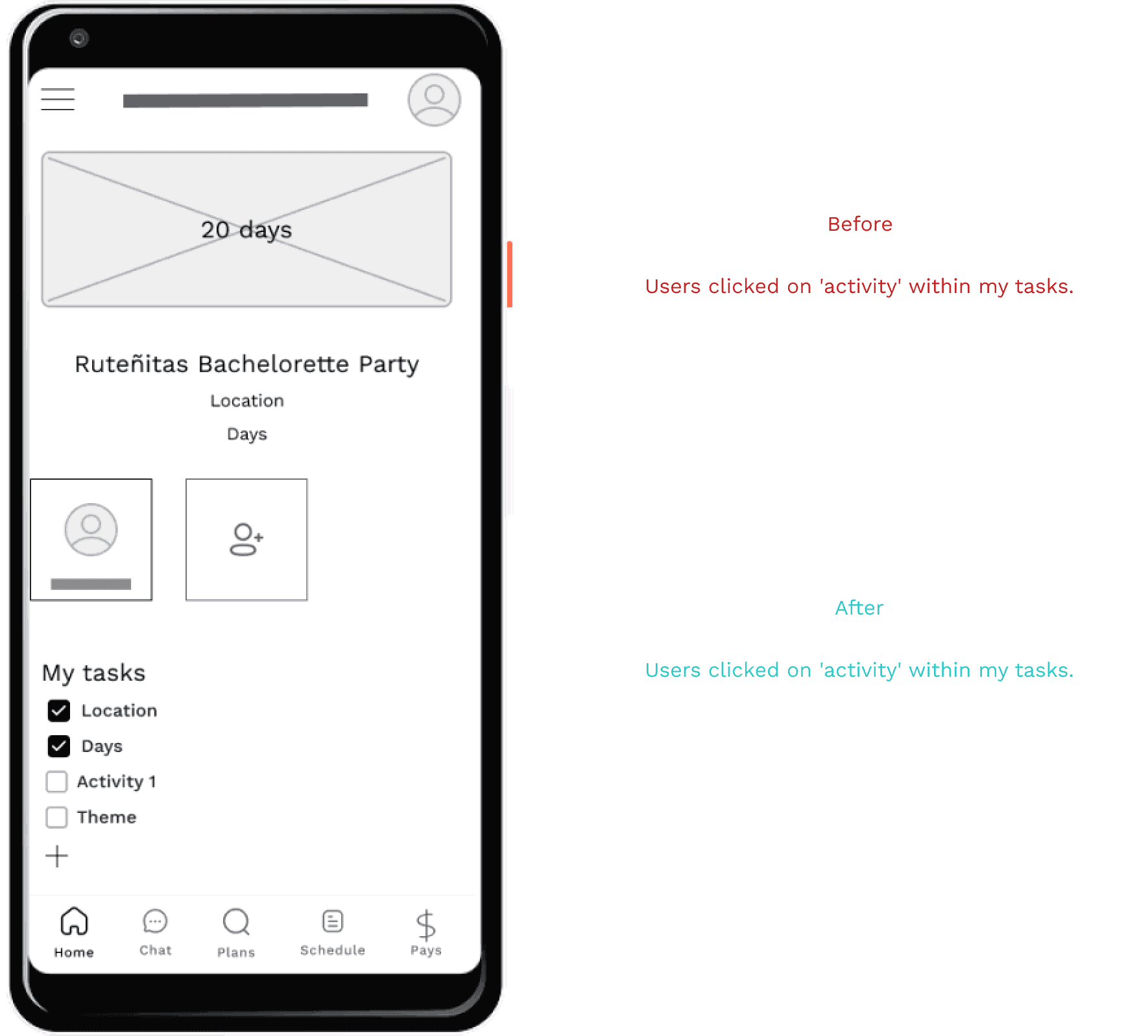
All participants had trouble finding the search activity button
search activity button is difficult to understand and the list of tasks confuses the user
“I prefer that in the search you put something like plans or activities. Search reminds me that I can search for more contacts.” (Participant 1)
Searching an activity
Roles
3 out of 5 participants saw a use for having roles and list of friends
list of invited people and the roles are useful for most people, but not an overwhelming majority
“It is importat to have the rol of administrator, to organise the activities, add to the calendar...” (Participant 4)
Low Fidelity prototipe
Conclusions
The objective of this project was to analyze users who wanted to create a great bachelor/bachelorette party for their friends to achieve the best experience through the Lastfling application.
In this process, I studied different tactics that would help me understand the situation, such as the study of User Personas, Benchmarking, creation of Storyboards, and development of low-fidelity wireframes.
Next steps
Enhance the value of surveys
Create a list of shared activities in the chat
Enable filtering by those with the highest number of 'yes' responses
Maintain a repository of all conducted surveys
Learnings
This project is based on the methodology from the Google UX Design course on Coursera:
Creation of Storyboards
Market analysis: company and UX perspectives
Moderated and non-moderated usability studies
Analysis of the data acquired from user tests
Proyect result
Minimum Viable Product in digital wireframes (MVP)
Improvements to the initial wireframes based on the results of the usability study.
Positive user feedback in the initial usability studies
Differentiation from current brands
Unique product in the field of operation
Acknowledgments
I appreciate this project, and I extend my gratitude to my friends in industrial design and family members for willingly participating in the usability tests. They provided me with both new ideas to incorporate and improvements to the design. Thank you very much for your assistance: Carmen, Roberto, Alfredo, Villena, and María José.